The next decade of reading machines
Forecasts about reading technology usually describe the screen and forget the reader. Here is an attempt at the opposite — one constraint that will not move, five that will, and the only frontier we think is worth competing on.
What this piece argues
- The language system sets the ceiling, and no product release has ever raised it
- Presentation, semantics, displays and accessibility all move; integration rate does not
- Accessibility stops being a category and becomes a setting everyone quietly uses
- The real frontier is comprehension guarantees, not words per minute
Predictions about reading technology have a poor record, and the failure is nearly always the same one: they forecast the display and forget the reader. Screens change every few years. The machinery behind the eyes has not changed across the century we have been measuring it. Any forecast worth writing has to hold that still while everything else moves.
So this piece is built in two halves. First, the constraint — the one number that a decade of engineering will not shift, stated plainly enough that you can hold every other claim against it. Then the moving parts, five of them, each of which we think will genuinely change what a reading tool looks like. Some of that second half is speculation. Where it is, we say so, and we do not attach a year to it.
We have an obvious interest here. We sell a reading app, and a forecast written by a company about its own market is a sales document unless it is willing to describe futures that are bad for the company. Two of the five below are bad for us. One of them, if it arrives properly, makes most of the industry’s current marketing unsellable, including some of the softer things we have said ourselves.
The constraint that will not move
A competent adult reads continuous prose at roughly 200–300 words per minute. That figure has been stable across a century of measurement, through the arrival of paperbacks, television, personal computers, the web and the phone. It is not a bad habit waiting to be corrected. It is the cost of the machinery. When researchers remove eye movement altogether and present words one at a time at a fixed point — which is exactly what this app does — reading gets somewhat faster, not multiples faster. The bottleneck is language processing, not vision.
This is the finding that ends most speed-reading claims, and it will end the next generation of them too. Nothing on the roadmap of any company, ours included, addresses it. Better rendering does not address it. A neural voice does not address it. A model in the browser does not address it. Anyone who tells you their next release raises the rate at which you integrate meaning is selling the thing that was sold in the 1960s with a new interface on the front — a story we tell at greater length in what happened to Evelyn Wood.
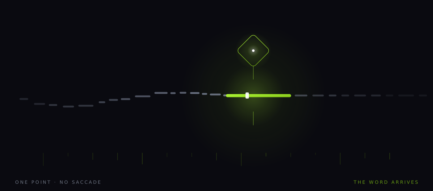
Hold that line flat, then, and watch what rises above it. Everything below is a change in how text is delivered, resolved, displayed or measured. None of it is a change in how fast you understand a sentence. That distinction is the whole argument, and it is the one most reading products blur on purpose.
Pace stops being a slider
Today the reader sets a rate and the app modulates around it locally: dwell stretches for long words, numerals, commas, sentence ends, and up to 2.8× at paragraph breaks. That is real, it ships, and it means your true rate on dense prose runs slightly under the nominal figure. But it is a response to the surface of the text — how long the word is, what punctuation follows it — not to how hard the text is.
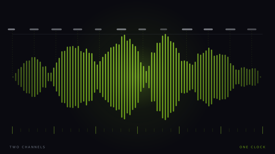
The next version of this responds to difficulty itself. Word rarity, sentence depth, the density of unfamiliar terminology, the arrival of a definition that the following three sentences depend on: all of these are computable from the text before a reader ever sees it, and all of them argue for a different dwell. A passage would then arrive with its own tempo rather than a single number applied uniformly to a chapter. We think this is close, because it needs no sensors and no new science — only careful work on what counts as difficulty. Whether readers prefer a pace they do not control is a separate question, and we do not know the answer. The stronger version, where the pace responds to you rather than to the page, is the subject of the pace that watches you, and it is harder than it sounds.
Meaning that fits inside a browser tab
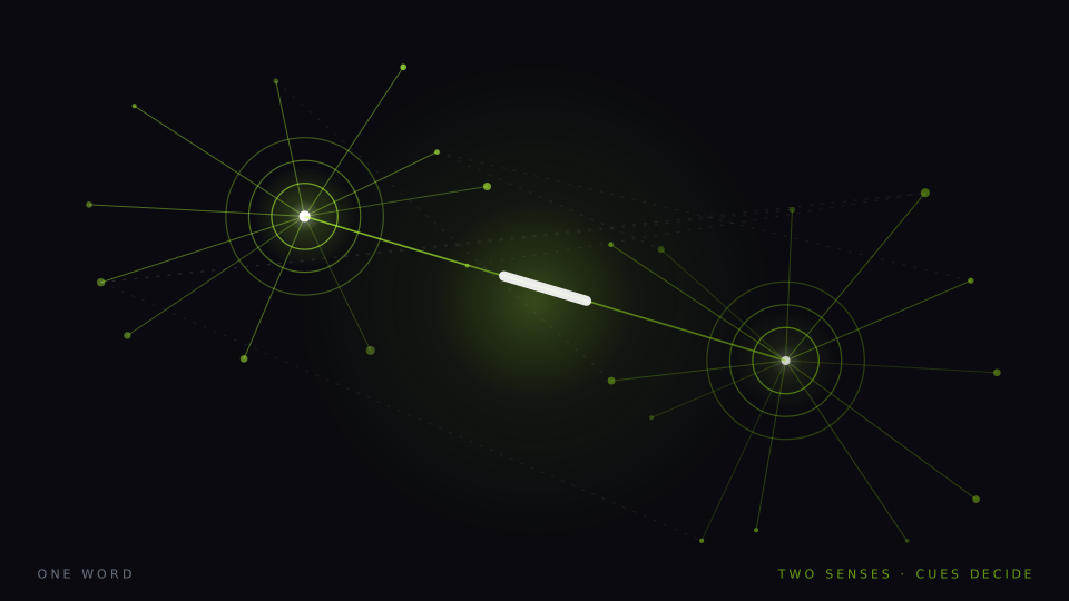
Every word in this app is paired with an image chosen by sense, and the sense is chosen by scoring context cues against an eight-word window either side. That method is fast, offline, and explainable — you can always ask why a picture was picked and get an answer. It is also brittle in known places: irony, metaphor, a common word used as a technical term, and any reference that reaches further than eight words back.
The obvious repair is a small model that understands word sense, running locally. That is not a fantasy: an 82-million-parameter open-weight neural voice already runs in this app inside the browser, on your machine, with nothing uploaded. It is the existence proof that useful models fit. Whether a sense model can meet the latency, determinism, download-size and battery constraints at the same time is a genuinely open engineering question, and we work through it honestly in semantics on the device. The version we can actually imagine shipping is duller than the version that sounds exciting.
Better rendering, better voices, better models. None of them raise the rate you understand a sentence.
The constraint, restated
The display leaves the rectangle
Reading interfaces have assumed a page-shaped surface since there were pages. That assumption is now optional. Watches, glasses, dashboards and heads-up displays are all surfaces where a paragraph is unreadable and a single large word is perfectly legible. Single-word presentation at a fixed point is unusually well suited to a screen the size of a stamp — not because it is clever, but because it needs almost no area and no line to track. A tool built around one word and one image is close to the only reading format that survives the shrink intact.
We are not predicting that people will read books on their glasses. We are noting that the format cost of doing so is lower for this design than for any layout-based one, and that a lot of practical reading — a message, a clause, a label, a name — is short enough that the surface question is the only question. Whether any of these devices reach the volume that would make it matter is not something we can forecast, and anyone who gives you a date for it is guessing.
Accessibility becomes a setting
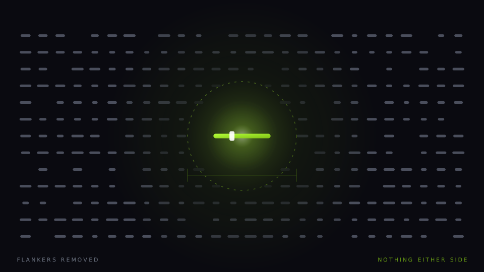
The mechanisms that make single-word presentation useful to a dyslexic reader are not special-purpose. Removing flankers removes visual crowding for everyone; crowding is simply larger for some readers. Removing the line removes place-keeping errors for everyone; the cost of keeping your place is simply higher for some readers. Reduced motion helps people with vestibular sensitivity and also helps anyone reading on a train. The same is true of pace: plenty of people run this app at 120–180 wpm, below a normal reading rate, purely for the fixed point.
So the direction we expect, and are building towards, is that the separate accessibility product disappears — not because access stops mattering but because the accommodations turn out to be defaults that suit everybody at eleven at night, on a small screen, on the fourth hour of a document. This is not a claim that a presentation setting treats anything. It does not. Dyslexia is a difficulty with decoding, not with thinking, and a way of presenting text is a way of presenting text. It is not a diagnosis, a therapy or a treatment, and we will never describe it as one.
The tool starts to know whether you understood
This is the one that changes the market, and it is the reason the other four are secondary. Every reading product on earth reports a rate, because a rate is trivial to compute and flattering to display. Almost none report whether anything landed. The asymmetry is not accidental: a number you can only go up on is a better marketing surface than a number that can fall.
A product that measures comprehension can be held to it, by its users and eventually by its buyers. That changes what can be advertised. It is also well supported as a design choice rather than merely an honest one — retrieval practice produces better retention than re-reading, so the check at the end of a passage is not overhead deducted from reading time; it is one of the more effective things in the session. This app already ends a passage with a recall check that mixes words which genuinely appeared with plausible distractors, and puts the score next to the speed.
Here is the concession, and it is not a small one. Our recall check is a recognition test. It asks what was present, which is a weak proxy for whether you followed an argument, could restate a position, or would notice the clause that contradicts the one on page two. It is better than nothing and considerably better than a rate on its own, and it is nowhere near a comprehension guarantee. We are also, unavoidably, grading our own homework: the same company writes the passage handler, the distractors and the score. A serious version of this needs tests somebody else designed.
| What changes | What cannot change |
|---|---|
| Pace responds to the text’s own difficulty rather than one setting | The rate at which a sentence becomes a proposition in your head |
| Sense resolution moves from scored context cues to a small local model | The need for the resolved image to be correct, or it competes with the sentence |
| The surface shrinks to a watch, a lens, a strip of glass | That re-reading is how comprehension gets repaired when it fails |
| Accessibility settings become defaults rather than a separate product | That decoding difficulty and comprehension difficulty are different problems |
| Comprehension gets measured, reported and eventually compared across tools | That people overestimate how much they understood, especially when it felt easy |
The industry has spent sixty years competing on a number that cannot move much and is easy to fake by skimming. Our view is that the interesting frontier is elsewhere: not speed, but comprehension guarantees — a defensible statement of the form at this rate, on material of this kind, this is what you retained, measured this way, and here is the test. Nobody ships that today, ourselves included. The pieces exist. The reason it does not exist is that it is a promise you can be caught failing.
Whoever ships an honest one first will make every rate-only claim in the category look like what it is. We would like that to be us. It is more important that it happens than that it is us, and if a competitor gets there with a better test than our recognition check, we will say so in public and then go and build a better one.
A note on what this is. Signal is written in-house by the team that builds Reader Inc., so treat it as an argument rather than a review. Nothing here is medical, psychological or educational advice, and the app is not a treatment, therapy or diagnosis for any condition. Where we describe research we describe it in general terms; where we are reasoning past the evidence we say so. The app is free, runs entirely on your own device, and ships with a comprehension test switched on — which means you can check every claim we make against your own reading rather than taking our word for it.
Read next
Semantics on the device
A neural voice with 82 million parameters already runs inside this browser tab. The question is whether a model that understands word sense can join it — offline, inside a 150-millisecond frame, without a download nobody would accept.
The pace that watches you
Adaptive reading is coming, and most of it will optimise for the wrong thing. A survey of the signals — behaviour, eyes, wearables, brainwaves — and the design argument that matters more than any of the sensors.
When the machines write everything
The cost of producing plausible prose has fallen close to zero. The volume arriving at every desk rises, the value per page falls, and the scarce thing stops being writing. It becomes attention that has actually been paid.