Keeping your place on the line
The return sweep is the longest, blindest jump the reading eye makes, and it is where places get lost. On losing your place when reading — and every tool, from finger to typoscope to software, that promises to hold it.
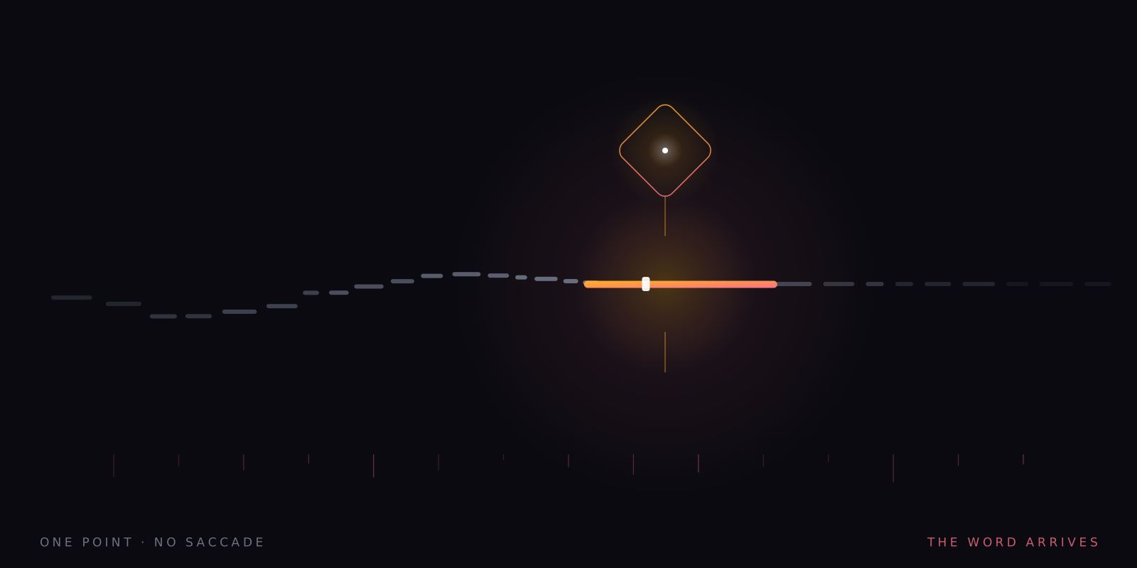
What this piece argues
- Line-tracking errors concentrate at the return sweep, the longest saccade on the page
- Long lines and tight leading both make the sweep harder to land
- Finger, card, reading ruler and typoscope all survive in software form
- Single-word presentation has no line to lose — and no line to re-read
The eyes reach the end of a line, sweep back to the left margin, and land wrong — a line too high, so the words feel eerily familiar, or a line too low, so the sentence stops making sense. Nothing on the page has moved. Losing your place when reading is so ordinary that most readers never count it as an error at all, but it is one, and it happens in a predictable place.
Reading is saccadic. The eyes do not slide along a line; they hop, in jumps of roughly seven to nine characters, resting for around 200–250 milliseconds between hops, functionally blind while in motion. Most of these jumps are short and practised, and they land well. But once per line the system asks for something different: a single leap from the right-hand end of one line all the way back to the left-hand start of the next. That is the return sweep, and it is the longest, least supported movement in the whole repertoire.
The sweep is launched towards a target the eye can barely see. The start of the next line sits far out in peripheral vision, where letters are crowded beyond recognition, so the sweep is aimed at a region rather than a word, and it is often followed by a small corrective hop once the eye arrives and can see where it actually is. The eye-movement literature treats this as normal machinery. It is also the obvious point of failure: aim a long jump across a block of near-identical lines, and sometimes you select the wrong one.
Regressions are not the same failure
It is worth separating two things that feel similar. Skilled readers make a backwards jump — a regression — on roughly one saccade in seven, and many of those are not motor errors at all: the reader went back because comprehension faltered, which makes the regression a repair. Losing the line is different. It is a navigation failure rather than a comprehension one, and it has its own signature — the paragraph read twice without noticing, the sentence that stops parsing because a line was silently skipped, the general sense of swimming through text instead of moving across it.
Two features of the page make line tracking harder, and both are choices someone made. A long line means a longer sweep, launched towards a start point sitting deeper in the periphery, with more room to drift on the way. Tight leading — lines set close together — shrinks the landing zone, so a small vertical error puts the eye on a neighbouring line instead of the target. Put the two together, as cramped PDFs and dense terms-and-conditions routinely do, and the page becomes an instrument for losing places. Shorter measures and looser leading are the cheapest fixes in all of typography.
The failure is not evenly distributed. Anyone reads a cramped page worse when tired; readers with low vision, and many older readers, report place-keeping as one of the most persistent frictions on the page; and screens plausibly make it worse than paper, because a scrolling page keeps redrawing the very geometry the reader was using as an anchor. We say plausibly — the anchoring point is a reasonable reading of the evidence rather than a settled finding. What is settled is the geometry: longer sweeps and tighter targets mean more errors, for everyone.
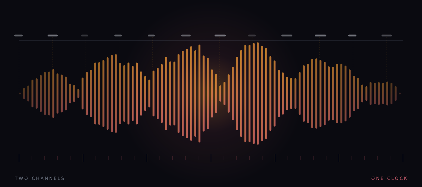
The folk toolkit, from finger to reading ruler
Readers solved this long before software did, with whatever was on the desk. The solutions are old, cheap and mostly sensible, because each does one of two things: it adds a marker that moves with you, or it removes the lines you are not reading. Every software feature in this territory descends from one of the four objects below.
- The finger. A moving marker under the current word. It holds your place across the sweep because it travels the line even while the eyes jump — and it survives in every reading app that lets you drag a highlight along the text.
- The card. A plain card held under the line masks everything below it and gives the sweep a hard edge to land against. Cheap, silent, and still the first thing many teachers reach for.
- The reading ruler. A strip — often tinted — with a clear window one or two lines tall. The window does the work: it isolates the current line and turns the rest of the page into background. The tint is the contested part; the evidence for colour specifically is weak, while the isolating window needs no such defence.
- The typoscope. A matt black card with a letterbox slot cut in it, borrowed from low-vision practice. It shows one line and deletes the rest of the page entirely, glare included. It is the most aggressive of the four, and the closest ancestor of what comes at the end of this article.
Move a marker with the reader, or delete the lines the reader is not on.
The folk toolkit, reduced to a mechanism
The software descendants
Every one of those objects now exists as a feature. Line-focus modes in reading apps and browser reading views dim or mask everything but the current line or three — the typoscope, rendered in pixels. Text-to-speech tools paint a moving highlight over the word being spoken, a finger that never tires; the case for that pairing is made in text-to-speech as a reading tool. And ebook apps let you narrow the measure and open the leading, which is not sold as a line-tracking feature but is the honest structural fix underneath all of them.
The software versions hold one genuine advantage over the desk objects: they move themselves. A card must be slid down the page by hand, which occupies a hand and a slice of attention. A line-focus mode advances when you do. The cost is the usual one — a tool that decides where you are can be wrong about where you are, and a highlight crawling at the wrong pace is worse than no highlight, because now there are two places to keep track of: yours and its.
The limiting case
Single-word presentation sits at the end of this road. This app shows one word at a fixed point on the screen; there is no line, so there is no line to lose, no sweep to mis-land, no neighbouring line to wander onto. Place-keeping is not assisted. It is abolished, along with the crowding that made the periphery unreadable in the first place — the fuller version of that argument is in the crowding problem.
The costs arrive immediately, and they are the same two every time. Words vanish, so nothing can be re-read: the regression, which is often a comprehension repair rather than an error, is deleted along with the navigation failure, and for dense or syntactically complex prose that loss is real. And there is no next line to preview — none of the coarse advance information about word length and shape that the eye normally gathers while it fixates. A reader who leans on re-reading should expect to feel both absences, and should not be talked out of noticing.
Cheap experiments first
The right order of experiment runs from free to structural. Take a card to the page, or a reading ruler if the window format suits you, and see whether the paragraph gets easier — many readers learn everything they need right there. In an ebook or a browser reading view, shorten the measure and open the leading. If line tracking still feels like a tax on every page, run a familiar passage through the app at an unhurried pace and take the recall check at the end. If the score holds while the effort falls, the line was costing you more than you thought.
None of this argues that the line is a bad technology. It is a superb one — dense, scannable, random-access — and its navigation costs are a fair price for those virtues most of the time. The argument is only that the costs exist, that they concentrate at the return sweep, and that they can be engineered down or engineered away. A reader who knows where their places get lost can choose the tool that holds them — and the best choice is the cheapest one that works.
A note on what this is. Signal is written in-house by the team that builds Reader Inc., so treat it as an argument rather than a review. Nothing here is medical, psychological or educational advice, and the app is not a treatment, therapy or diagnosis for any condition. Where we describe research we describe it in general terms; where we are reasoning past the evidence we say so. The app is free, runs entirely on your own device, and ships with a comprehension test switched on — which means you can check every claim we make against your own reading rather than taking our word for it.
Read next
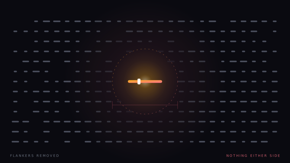
The crowding problem
A letter you can read easily on its own becomes hard when other letters sit beside it. Crowding is normal, it is measurable, and it is the one thing single-word presentation does not merely reduce but abolishes.
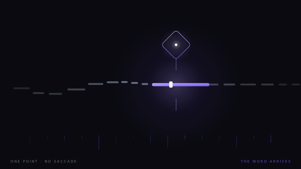
Let the word come to you
Word-by-word presentation removes eye movement completely, and eye movement is a real cost. It is also a much smaller cost than the speed-reading industry needs it to be. Here is the arithmetic, with nothing rounded up.
Low vision and the large-print problem
Bigger letters seem like the obvious answer, and sometimes they are. But magnification has a paradox at its centre, and the honest survey of low vision reading tools has to start there — with what enlargement quietly takes away.