Pictures before words
For a great many readers the picture is not a decoration on the text. It is the primary channel. There is a serious, decades-old tradition of building for those readers, and we are standing downstream of it.

What this piece argues
- Symbol-supported text and Easy Read are established practice, not a new idea
- An icon resolved by sense is structurally similar to a symbol set, with different failure modes
- Hand-built symbol sets stop where the drawing stopped; five tiers means ours does not stop
- Purpose-built symbol systems are standardised and validated in ways our icons are not
Long before anyone paired a word with an animated icon on a screen, there were people cutting symbols out of card and fixing them to a board. Symbol-supported text and Easy Read documents predate this app by decades. They were developed with the readers who use them, they have an established practice behind them, and anything we say about pictures and meaning is said downstream of that work.
Most writing about images in reading treats the picture as an aid — something added beside the text to help a reader who is having trouble with the text. For the readers in this article that description is the wrong way round. The picture is not support for the sentence. For long stretches it is the sentence, and the words are the part that arrives late, partially, or not at all.
We should be plain about how we got here, because it was not by design. Reader Inc. pairs every word with an icon chosen by sense because we thought the reason conventional speed reading destroys comprehension is that it strips the mental picture out. That is an argument about dual coding, made for ordinary readers at speed, and it is set out in the second channel. It happens to have landed adjacent to a tradition that has been thinking about pictures and meaning far longer and far more carefully than we have. That adjacency is the most interesting thing about the product and also the source of its largest honest limitation.
The tradition we are standing next to
Symbol sets such as Widgit and PCS are used every day in schools, day services and clinics to produce symbol-supported text: each content word carries a small standardised graphic, consistent across every document a reader encounters. Blissymbolics sits behind them as a historical landmark — a constructed graphic language, taken up in the 1970s for communication with children with physical disabilities, and one of the origins of what became augmentative and alternative communication. Easy Read is a related but distinct practice, in which the language of a document is deliberately simplified and each idea is paired with a supporting picture. These are professional disciplines with guidelines, training and users who were involved in building them.
It is worth saying what they get right that a general-purpose piece of software does not. A symbol set is standardised, so the same idea gets the same mark every time, in every document, for years. That consistency is not a nice-to-have. It is the whole mechanism: a reader learns the mark, and having learnt it, owns it. Symbols are designed with disabled people rather than for them, tested with them, and revised. And Easy Read is not illustration. It is a discipline of rewriting — shorter sentences, one idea per line, plain words — with the picture as the second half of the job, not the whole of it.
Five kinds of reader, one shared property
These groups are not the same as each other and it would be careless to write as if they were. What they share is narrow: for each of them, at some point in the process, meaning is more reliably available through an image than through a string of letters.
- Readers with intellectual disability
- The population symbol-supported text was largely built for. Reading may be partial, effortful or word-by-word, while understanding of a topic is intact. Consistency of the symbol matters more here than anywhere else.
- People who use AAC
- For someone communicating through a picture-based symbol set, symbols are already the working vocabulary. Reading material that uses the same symbols is continuous with how they speak; reading material that uses different ones is a second language.
- Readers with acquired language difficulty
- After a stroke or brain injury, word retrieval can fail while conceptual knowledge is untouched. An image offers a route to a meaning that does not require the word form to come back first. This is covered properly in reading after.
- Children learning to read
- Decoding is under construction, and picture and word are learnt side by side by design. This is ordinary early-literacy practice rather than an accessibility question, and the people who do it well are teachers using structured literacy instruction.
- Adults reading a second language
- The bottleneck here is specific and different: meaning is routed through a first-language translation, which costs time and leaves the second-language word attached to another word rather than to a thing. An image attached to a sense builds that link directly.
Resolving by sense rather than by spelling
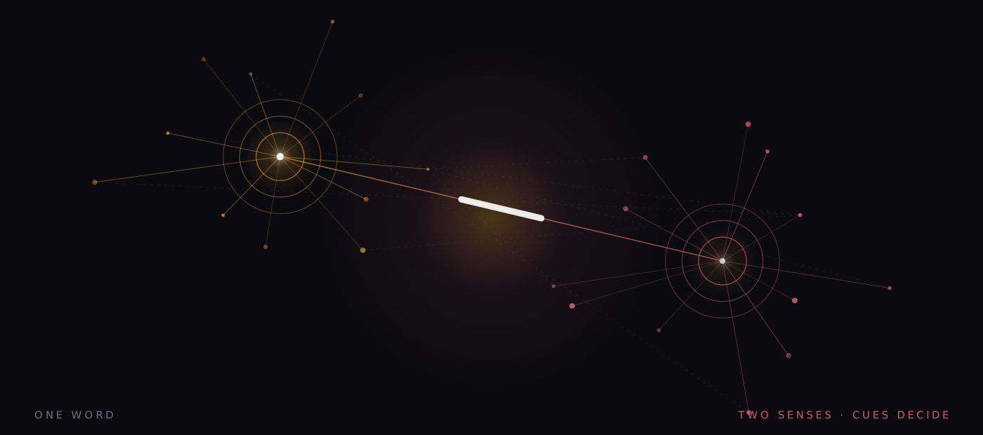
Here is the intellectual point, and it is the one part of this article where we think we have something to add. A symbol set maps a concept to a mark. It is not a spelling-to-picture lookup, which is why the same symbol serves across inflections and why two different words for one idea can share it. Our resolver works the same way: it scores context cues against an eight-word window either side, so bank in “the grassy bank of the river” resolves to a different image from bank in “walked to the bank for a loan”. That is sense resolution, not keyword matching, and it is structurally the same kind of operation a symbol set performs by hand.
The difference is where each approach fails. A hand-built symbol set stops at the edge of what somebody had time to draw. Vocabularies are large and carefully maintained, but they are finite, and the moment a reader meets a word outside the set the support simply is not there — usually on exactly the specialised or unusual word that most needed it. Our resolver has five tiers tried in order: 528 hand-drawn curated icons across roughly 3,100 sense entries, then compounds (riverbank becomes river plus bank), then ten morphological modifiers for things like negation, agency, plurality and tense, then a library of over 200,000 open-source icons from more than 150 sets, and finally a procedural mark derived deterministically from the word itself. The last tier cannot fail, so coverage is 100%. Nothing is ever left blank.
A hand-drawn symbol set stops where the drawing stopped. That is the failure we designed against.
Coverage, as a design goal
What we cannot match
Now the concession, and it is not a small one. Coverage and quality are different things, and by trading one for the other we lose precisely the property that makes a symbol set work. Tier one is consistent, because it is hand-drawn and curated. Tiers four and five are not consistent in the same way: the library pulls from open sets of varying style and quality, and the procedural tier produces a mark with no semantic content whatsoever — it is a legible, stable shape for that word, and that is all it is. A reader who has learnt that a particular mark means a particular thing is relying on a stability we can only guarantee at the top of the stack.
That is the difference between an icon and a symbol. A symbol has been agreed. Ours has been computed. The two can look identical on screen and they are not doing the same job, and anyone comparing Reader Inc. with a purpose-built symbol system should weigh consistency and validation on their side against coverage and cost on ours. Every image in the app is labelled with the tier that produced it, which is the least we can do: it lets a teacher see at a glance which words are being carried by a curated drawing and which are being carried by a shape.
Pinning a sense, and drawing your own
There is one design consequence we think we did get right, and it follows from resolving by sense. Because the unit is a sense rather than a spelling, a sense can be pinned. If the resolver picks the wrong reading of a word for the subject you are working in, you can fix that reading in a personal lexicon and it stays fixed. Custom icons go in the same way, which is the feature that matters most for the readers in this article: a teacher, a speech and language therapist or a parent can point the app at the symbols a person already uses, rather than asking that person to learn a second set of pictures for one piece of software.
That is the honest position on where this sits. Structured literacy instruction is what teaches children to read. Speech and language therapy is what changes outcomes in acquired and developmental language difficulty. Specialist assessment is what identifies what is actually going on with a particular person, and symbol systems and Easy Read are established practice built by people who did the long work of designing with their users. All of those are the interventions. This is a way of putting text on a screen, and putting it beside those things rather than in place of them is not modesty, it is accuracy.
So the practical suggestion is a small one. Take a page somebody actually needs to read — a letter from a service, a chapter, a set of instructions — and run it through the app with icon above word, then again with icon replaces word, which turns content words into pure image while function words stay as text. Watch what the reader does, not what the screen does. It is free, nothing is uploaded, and if the pictures are not landing you will know inside a page.
A note on what this is. Signal is written in-house by the team that builds Reader Inc., so treat it as an argument rather than a review. Nothing here is medical, psychological or educational advice, and the app is not a treatment, therapy or diagnosis for any condition. Where we describe research we describe it in general terms; where we are reasoning past the evidence we say so. The app is free, runs entirely on your own device, and ships with a comprehension test switched on — which means you can check every claim we make against your own reading rather than taking our word for it.
Read next

The second channel
Most reading tools treat pictures as ornament. In this one the picture is structural — it is there to carry the load that the inner voice drops when the words start moving too fast to pronounce.
Decoding is not comprehension
Dyslexia is a difficulty with word recognition, decoding and spelling. It is not a difficulty with thinking. That distinction decides which tools are honest, which are useless, and what a presentation setting is entitled to claim.

Reading after
Stroke, brain injury, MS, the fog reported after some cancer treatments, long COVID, ordinary ageing. Different mechanisms entirely, with one thing in common: someone who read comfortably now finds it work.