What dyslexia-friendly fonts actually buy
Dyslexie and OpenDyslexic are sincerely made and widely loved. Controlled comparisons keep finding that a well-spaced ordinary sans-serif does just as well. What dyslexia-friendly fonts actually deliver — and why comfort still counts.
What this piece argues
- Special typefaces are preferred by many readers, and preference is a real finding
- Controlled comparisons generally show no advantage over a well-spaced ordinary sans-serif
- Most of the measurable benefit is spacing and weight, available in any font
- Comfort is worth keeping even when measured performance is unchanged
The best-known dyslexia-friendly fonts were designed by people who meant it. Heavier bottoms so letters cannot seem to flip, mirrored pairs redrawn until they no longer mirror, generous air around every character — and many readers who try them say they never want to go back. Then the controlled comparisons arrive and keep saying the same mildly deflating thing. This piece is about what these fonts actually buy, which is not nothing, and not quite what the name promises.
Dyslexie, designed by a dyslexic graphic designer, and OpenDyslexic, its open-source sibling, are the famous examples, and their design logic is easy to read off the letterforms. The letters b, d, p and q — mirror images of one another in most typefaces — are given distinct shapes. Baselines are weighted, as if each letter had ballast, on the theory that heavier bottoms stop letters appearing to rotate or swap. Ascenders are lengthened, openings widened, and the default spacing between letters, words and lines is far more generous than in an ordinary text face.
None of this is cynical. These faces were made in good faith, usually from lived experience, and they are frequently given away. Whatever the evidence ends up saying about performance, the sincerity of the design is not in question, and neither is the enthusiasm of many of the people who use them. The question worth asking is narrower: which of those design decisions does measurable work, and which are doing something else?
The theory inside the letterforms
The letterform argument assumes that dyslexia is substantially a visual problem — that letters flip, swap and crowd, and that a typeface engineered against flipping and swapping therefore attacks the root. But the dominant scientific account of dyslexia is phonological: a difficulty with the sound structure of language and with mapping sounds onto letters, not a difficulty with perceiving shapes the right way up. Letter reversals happen, especially early in learning to read, and they are far more visible to onlookers than they are central to the condition. A typeface aimed at reversal is aimed at a smaller part of the problem than its name implies.
It is worth pausing on why the flipping story is so durable, because it is not stupidity. Reversed letters are the most conspicuous error a struggling young reader produces — visible to any parent looking over a shoulder, memorable in a way that a slow, effortful mapping of sounds to letters is not. A typeface is a visible fix for a visible symptom, and visible fixes are easy to believe in. The phonological machinery that the evidence actually points to does its failing quietly, out of sight, which is a much harder thing to design a font against.
The spacing argument is on much firmer ground. Visual crowding — the interference of neighbouring letters with the letter you are trying to recognise — is a general property of vision, it is the mechanism behind the one typographic intervention with reasonable support, and increased spacing has been found to improve reading speed and accuracy in dyslexic children with no training involved. We have written about the mechanism at length in the crowding problem. Note what this means: the best-supported feature of the dyslexia fonts is the one that has nothing to do with their special letterforms.
What the comparisons find
When researchers put these typefaces into controlled comparisons — same text, same size, reading speed and accuracy measured rather than asked about — the recurring result is that dyslexia-specific faces do not outperform ordinary readable fonts, and in some comparisons they read more slowly. That result has turned up more than once, in more than one language, and it is fairly stable across studies. It is not a debunking of the designers. It is a specific finding about a specific claim: the special letterforms, as letterforms, have not been shown to do measurable work.
There is a confound hiding in the happier anecdotes, and it is the interesting part. These fonts ship with unusually generous default spacing. A reader who switches to OpenDyslexic gets new letterforms and roomier text in the same moment, and credits the letterforms. When a plain sans-serif is given the same spacing and weight, the difference generally evaporates. The most likely reading — and the fairest one — is that most of what these faces deliver is spacing and weight, both of which any competent reading app can apply to a font you already like.
Most of what these faces deliver is spacing and weight — and any font can be given both.
The confound, stated plainly
Preference and performance are different measurements
When readers are asked which typeface they prefer, dyslexia-friendly faces often do well, and dismissing that would be its own mistake. Preference and performance are both real measurements; they simply measure different things. Performance is words per minute and errors per page. Preference is closer to: how does it feel to sit with this text for an hour, and would you willingly come back tomorrow? Reading is a task people quietly avoid when it is unpleasant, so a font that makes someone willing to read is doing genuine work even at identical measured speed.
The mistake is not valuing comfort. The mistake is letting comfort be marketed as remediation. “Readers prefer it” and “it improves reading” are different sentences, and the gap between them is where most of this market’s overclaiming lives. A person is entitled to choose a typeface the way they choose a chair — for comfort, without a clinical justification — and vendors are not entitled to sell the chair as physiotherapy.
What to do with this
The practical conclusion is cheap and slightly anticlimactic. Take the spacing; treat the font as a preference. Raise letter spacing and line spacing wherever you read regularly — in your ebook app, your browser, your document reader — and keep whatever helps. If a dyslexia-specific face feels better to you, use it without embarrassment; nearly all of them cost nothing. Just do not pay money, or trade hope, on the promise that the letterforms themselves will change your reading, because that is the one claim the evidence has repeatedly declined to support.
If you want a better answer than the general one, run the comparison on yourself, and run it honestly. Take two passages of similar difficulty, read one in the special face and one in a plain sans-serif given the same size and spacing, time both, and ask yourself two or three concrete questions about each afterwards. Judging by feel measures comfort, which is fine, so long as you know that is the thing being measured. Ten minutes of this beats any amount of forum testimony, because it is evidence about the only reader whose results matter to you.
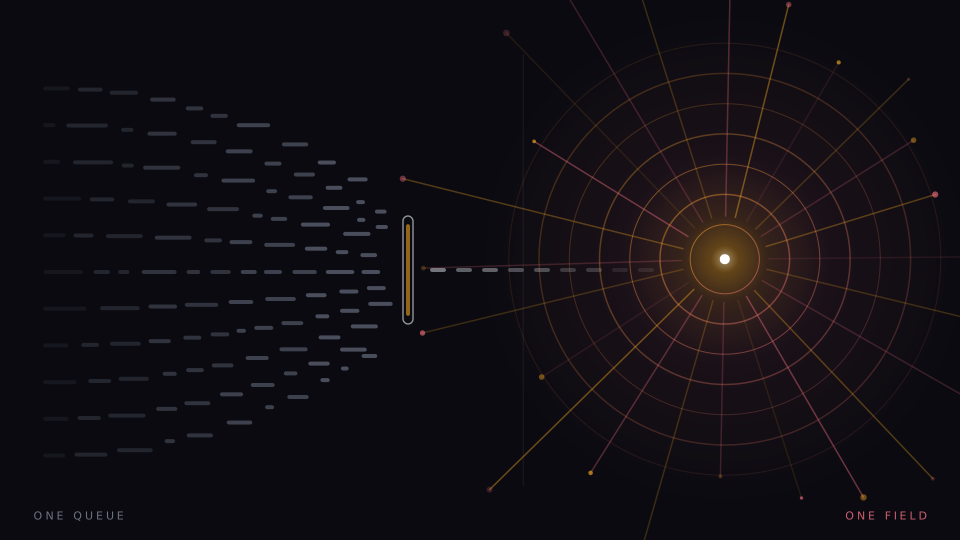
We should declare our own position honestly, because our app sits at an odd angle to all of this. Presenting one word at a fixed point removes crowding structurally rather than typographically — there are no neighbouring words to space — so most of the typography debate simply does not apply to it, and we cannot claim its presentation helps dyslexic readers either: it has not been tested with them. For an adult weighing the whole toolbox, typefaces included, the fairer overview is reading tools for dyslexic adults.
The best font for dyslexia, such as it is
People arrive at this article by asking for the best font for dyslexia, so here is the answer the evidence supports rather than the one the question wants. It is: a clean, ordinary sans-serif that you personally find pleasant, set larger than you think you need, with letter and line spacing pushed up until the page looks slightly too airy — and, if one of the purpose-built faces feels better than that, then that one, chosen with a clear view of what it is and is not doing.
The most useful thing the dyslexia fonts achieved may turn out to be cultural rather than typographic. They put it in public that a page is a design choice — that text can be rearranged to suit the reader instead of the reader being rearranged to suit the text — and they made millions of people go looking for the spacing controls for the first time. The letterforms get the headlines. The air between them does the work.
A note on what this is. Signal is written in-house by the team that builds Reader Inc., so treat it as an argument rather than a review. Nothing here is medical, psychological or educational advice, and the app is not a treatment, therapy or diagnosis for any condition. Where we describe research we describe it in general terms; where we are reasoning past the evidence we say so. The app is free, runs entirely on your own device, and ships with a comprehension test switched on — which means you can check every claim we make against your own reading rather than taking our word for it.
Read next
The crowding problem
A letter you can read easily on its own becomes hard when other letters sit beside it. Crowding is normal, it is measurable, and it is the one thing single-word presentation does not merely reduce but abolishes.
The bold-prefix family
Bolding the first few letters of every word became one of the most popular reading interventions ever released, and one of the least supported. That gap is worth taking seriously rather than scoring points off.
Choosing a reading app for dyslexia
Any reading app for dyslexia is making claims the moment it names its audience. Five questions separate the honest tools from the wishful ones — and because fairness demands it, our own app answers them last.